
Our Visit + Conversation with Farrow and Ball!
Read Farrow & Ball’s writeup about their visit and conversation with us…

So Farrow & Ball paid us a visit in May this year, and we had a lovely conversation with them about using paint and color, and working with sustainable products. We had a blast and are thrilled to share their writeup about it all!


11 New Colors from Farrow & Ball!

The end of September introduces not only a new season… we’re also welcoming 11 new paint colors by Farrow & Ball! Perfect Autumn timing for some colorful excitement.
STIRABOUT
Stirabout is inspired by the nurturing porridge favored over many centuries in Ireland. An earthy tone with just a hint of underlying grey, it’s perfect for creating a relaxed feel, which will never be too cold. Try pairing it with Jitney and natural fabrics for a laid-back look.
Recommended Primer & Undercoat: White & Light Tones
EDDY

A gentle green named after the circular currents enjoyed by wild water swimmers as a natural jacuzzi. This evocative color creates a seamless connection with nature, perfect for use in a garden room or alongside natural materials. A breath of fresh air, Eddy is also an ideal choice for calm, relaxing spaces. It is delicate in tone without crossing into pastel and sits at the lightest end of the French Gray and Treron family.
Recommended Primer & Undercoat: White & Light Tones
TAILOR TACK

The lightest and most delicate of our pinks, this charming color is that of the tacking thread used in Haute Couture ateliers. It may be delicate but it’s strong in character and has enough color contrast with white. Perfect paired with vintage finds or industrial accents, this shade works well in both traditional and modern schemes.
Recommended Primer & Undercoat: White & Light Tones
TEMPLETON PINK

A historic-feeling pink, this shade was developed for the dining room at Templeton House to offset the magnificent Wedgwood plaques made to commemorate the former owner, although it suits a contemporary setting just as well. A more intense version of Setting Plaster or Pink Ground, it creates a warm, welcoming space, particularly in low light where this shade becomes surprisingly deep.
Recommended Primer & Undercoat: Mid Tones
BAMBOOZLE

Our most spirited red, the name of this fiery hue was originally used to describe the deceit of pirates. Full of buccaneering spirit, Bamboozle brings joy and warmth to any room scheme and is easy to use in both traditional and modern homes. It will hold its own in any light and pairs brilliantly with other strong colors, like Beverly and Wine Dark.
Recommended Primer & Undercoat: Red & Warm Tones
HOPPER HEAD

Sitting between the ever-popular Railings and Down Pipe, this classic charcoal color is inspired by the attractively designed iron containers used to catch rainwater at the top of a downpipe. Ideal for creating inviting spaces, Hopper Head works beautifully with nearly any Farrow & Ball shade or can be used exclusively across walls, woodwork and the ceiling for a dramatic space.
Recommended Primer & Undercoat: Dark Tones
SELVEDGE

A lighter, less grey version of popular De Nimes, Selvedge is named after the highly prized denim woven on a shuttle loom to produce closed edges. It’s particularly good in low-light spaces, creating a familiar and friendly atmosphere, making it suited to bedrooms or rooms you spend time in, in the evening. It pairs beautifully with accents of darker colors like Inchyra Blue or Hopper Head.
Recommended Primer & Undercoat: Mid Tones
KITTIWAKE

This clean cool blue is inspired by the wings of seabirds when seen in bright sunlight. Sitting between Parma Gray and Lulworth Blue, Kittiwake has a touch more black pigment creating a warmer, more relaxed feel. This shade is perfect for living spaces, staying truly blue in all lights. It also complements stainless steel especially well, so is ideal for contemporary kitchens. A sophisticated blue, it looks fantastic with Wine Dark and Borrowed Light.
Recommended Primer & Undercoat: White & Light Tones
WINE DARK

Inspired by midnight skies, this spiritual color is named after the term Homer used to describe the sea. Our richest blue, it’s the perfect addition to our strong blue family, being more sophisticated than Stiffkey Blue and more upbeat than Hague Blue. In low-light, Wine Dark becomes even richer, making it particularly glamorous in candlelight and perfect for creating intimate spaces.
Recommended Primer & Undercoat: Dark Tones
WHIRLYBIRD
For an upbeat space, try this lively green. A lighter version of Breakfast Room Green, Whirlybird is inspired by the papery winged seeds beloved by many playful young gardeners and nature lovers. It looks particularly lively in morning light and is complemented by Beverly and James White.
Recommended Primer & Undercoat: Mid Tones
BEVERLY

This clean mid green is named in honor of a kind and generous member of our Farrow & Ball team who is sadly no longer with us. A dependable, uncomplicated color, with the ability to feel even greener in bright daylight or more conservative in lower light. This shade is a beautiful addition to any home.
Recommended Primer & Undercoat: Dark Tones
A couple new things with the paint launch to keep in mind:
11 colors are now archived! View the following now located in the Archive Collection (we can still make them though)- Savage Ground #213, Salon Drab #290, Radicchio #96, Blazer #212, Pale Hound #71, House White #2012, Churlish Green #251, Pavilion Blue #252, St Giles Blue #280, Pitch Blue #220, Mahogany #36
Some of these 11 new colors are not available in all finishes yet. Please wait until early 2023 for the following to be available-
Full Gloss finish in Hopper Head, Bamboozle, Wine Dark, Beverly
Exterior Eggshell in Hopper Head, Wine Dark, Beverly
Exterior Masonry in Kittiwake, Templeton Pink, Selvedge, Whirlybird, Hopper Head, Bamboozle, Wine Dark, Beverly

All items are available at our Shop & Studio to purchase, including sample pots (which come in the Estate Emulsion 2% sheen/ flat finish)! Don’t forget your complimentary copy of a new foldout color card. View our Primer Guide for proper application advice on all projects. Visit us soon to see all the new, colorful additions!
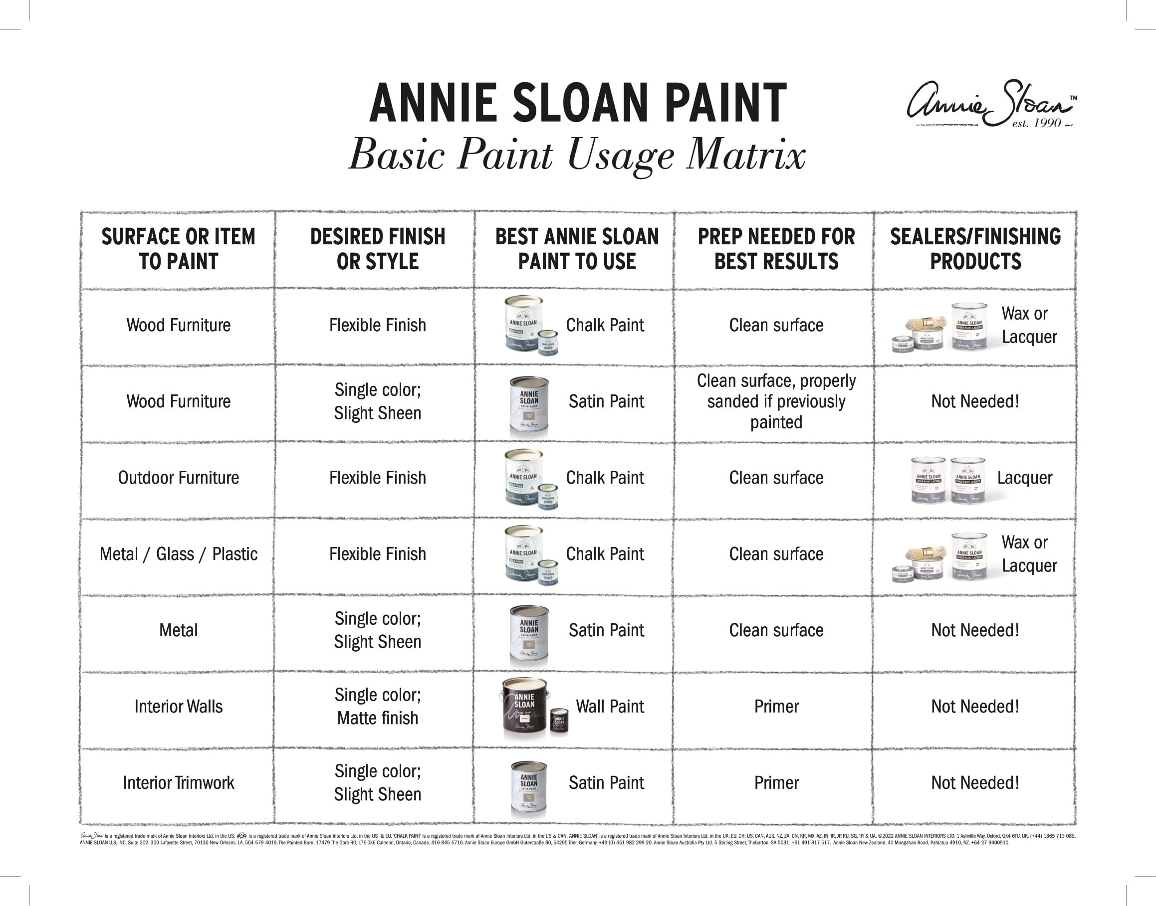
What to Choose for Your Next Project- Annie Sloan Paints

Today we’re sharing a short but informative compilation of how to choose the best Annie Sloan paint for your next project! If you haven’t heard yet, Annie Sloan’s new Satin Paint and Wall Paint have finally reached us in the US, and we are fully stocked. We absolutely love these new additions as they create a full ‘story’ for your spaces when combined together with Chalk Paint®.
Now, how are they different from the original Chalk Paint® and how do you know which is best to use for your projects? Firstly, while there are some colors repeated throughout all three paint lines, there are some only featured in the new collections or are even exclusive to the new collections (yes there are some gorgeous new colors NOT seen with Chalk Paint® before!). But as for choosing based on what your surface type is, where it’s located, and what your final look wants to be, see our lovely simplified chart below:

For square footage coverage:
Chalk Paint® covers 150 SF per tin per coat
Satin Paint covers 118.4 SF per tin per coat
Wall Paint covers 387 SF per gallon per coat
Aaaannd, that’s it! Stay tuned for more projects and blog posts featuring these great new paint additions. In the meantime visit us at our Shop & Studio to see samples in-person and to shop all things paint (you can shop online with us too of course, but it’s more fun to see your faces).


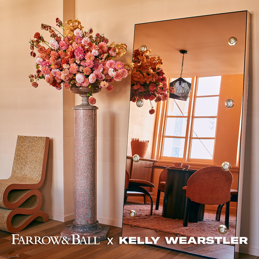
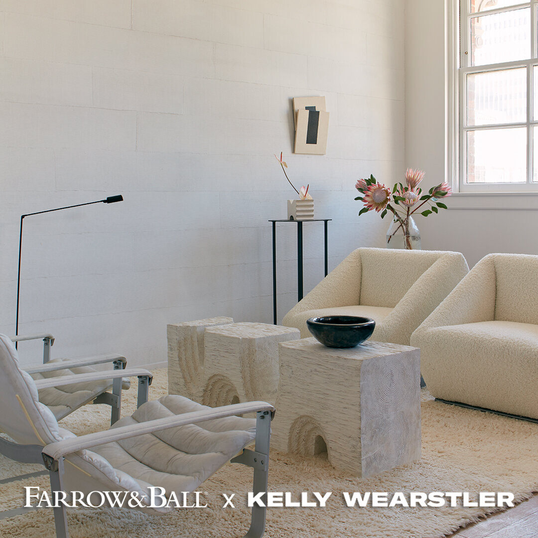
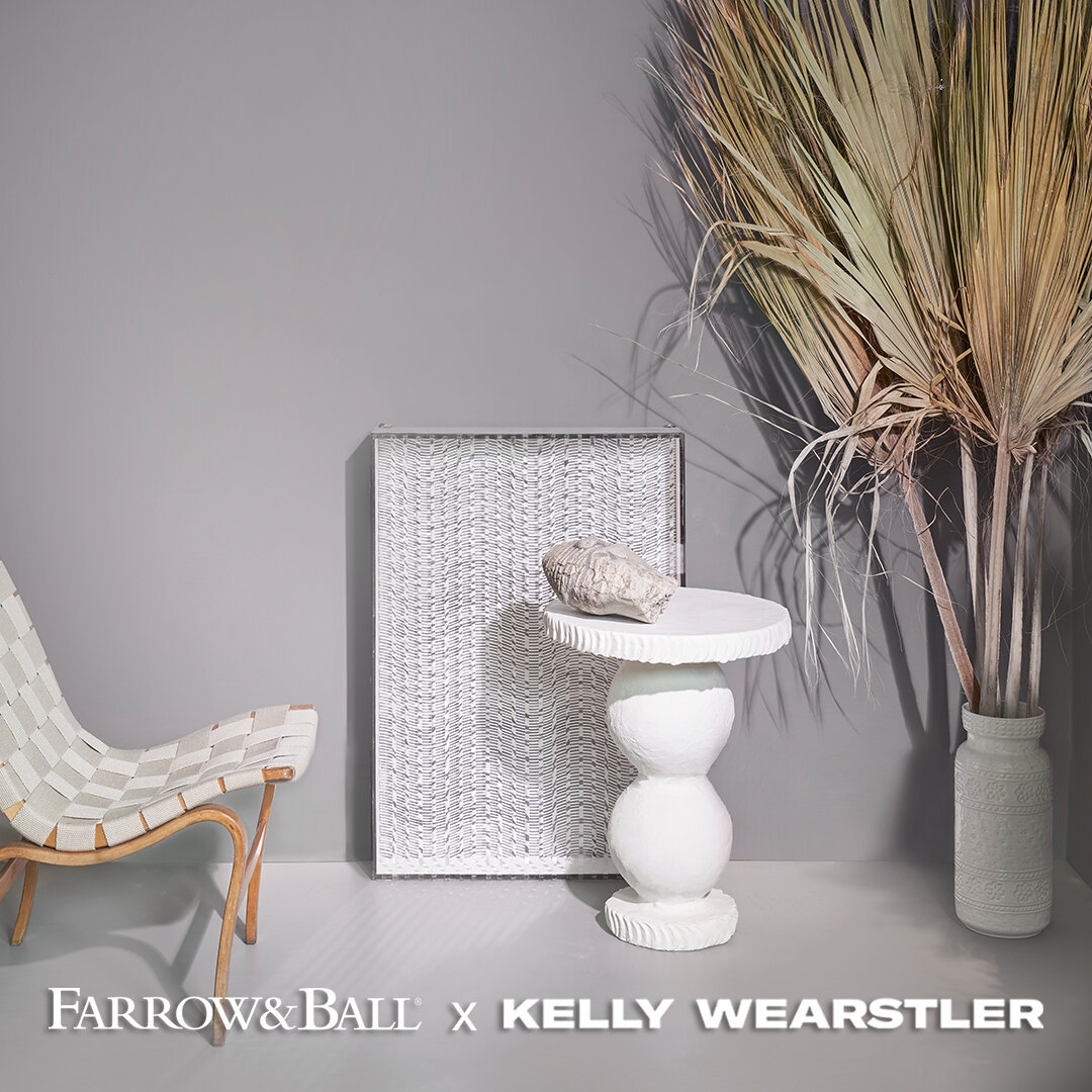
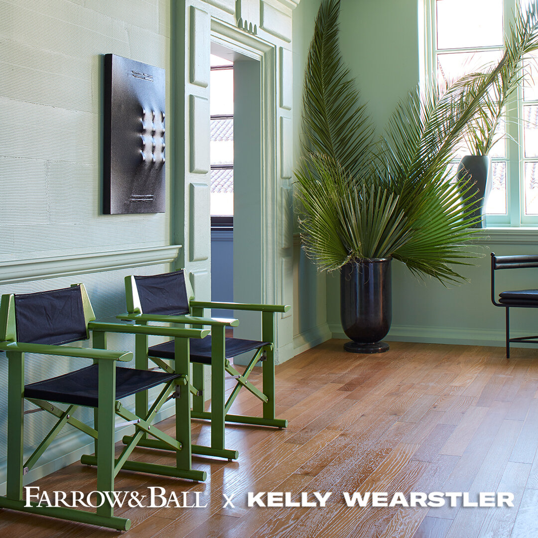
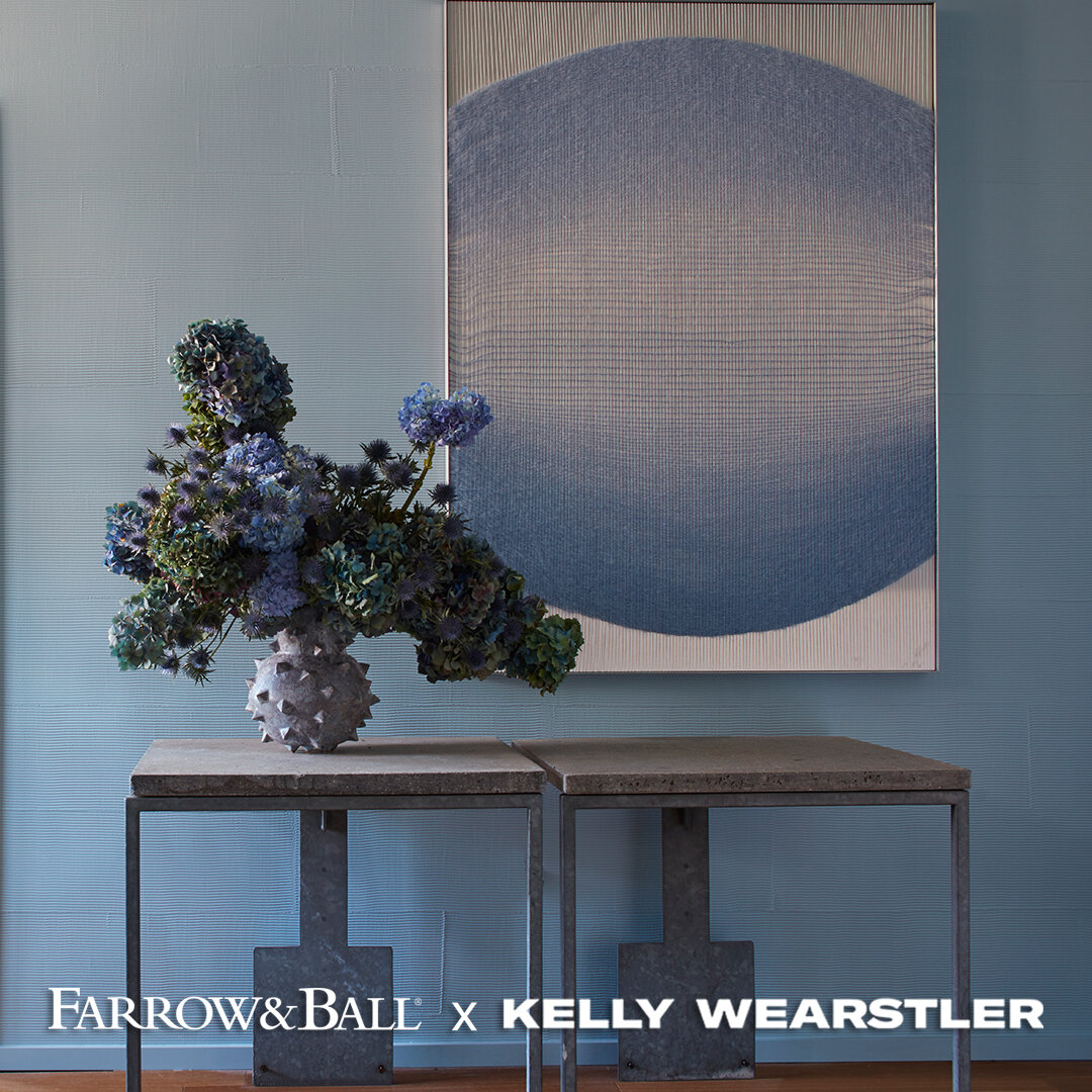
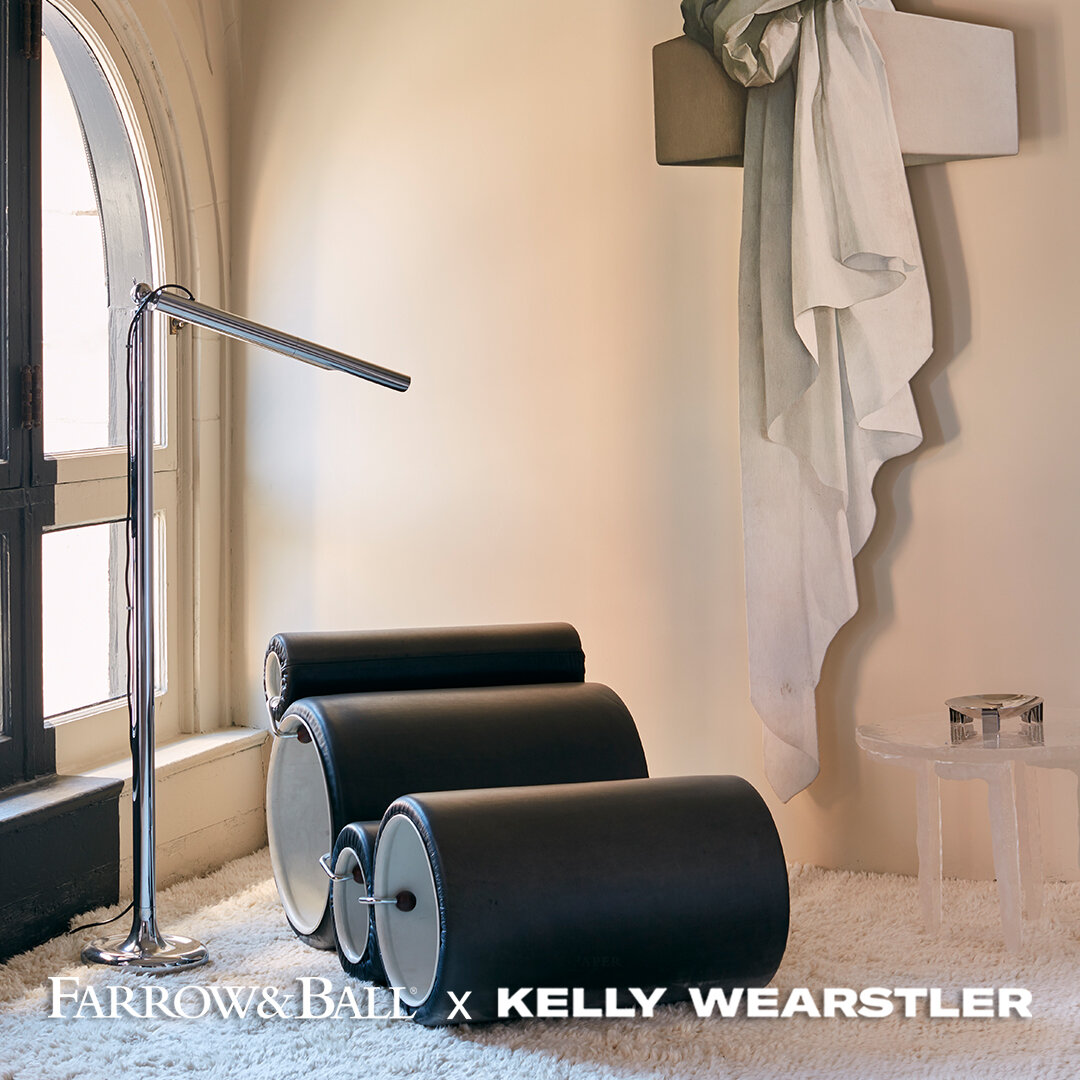
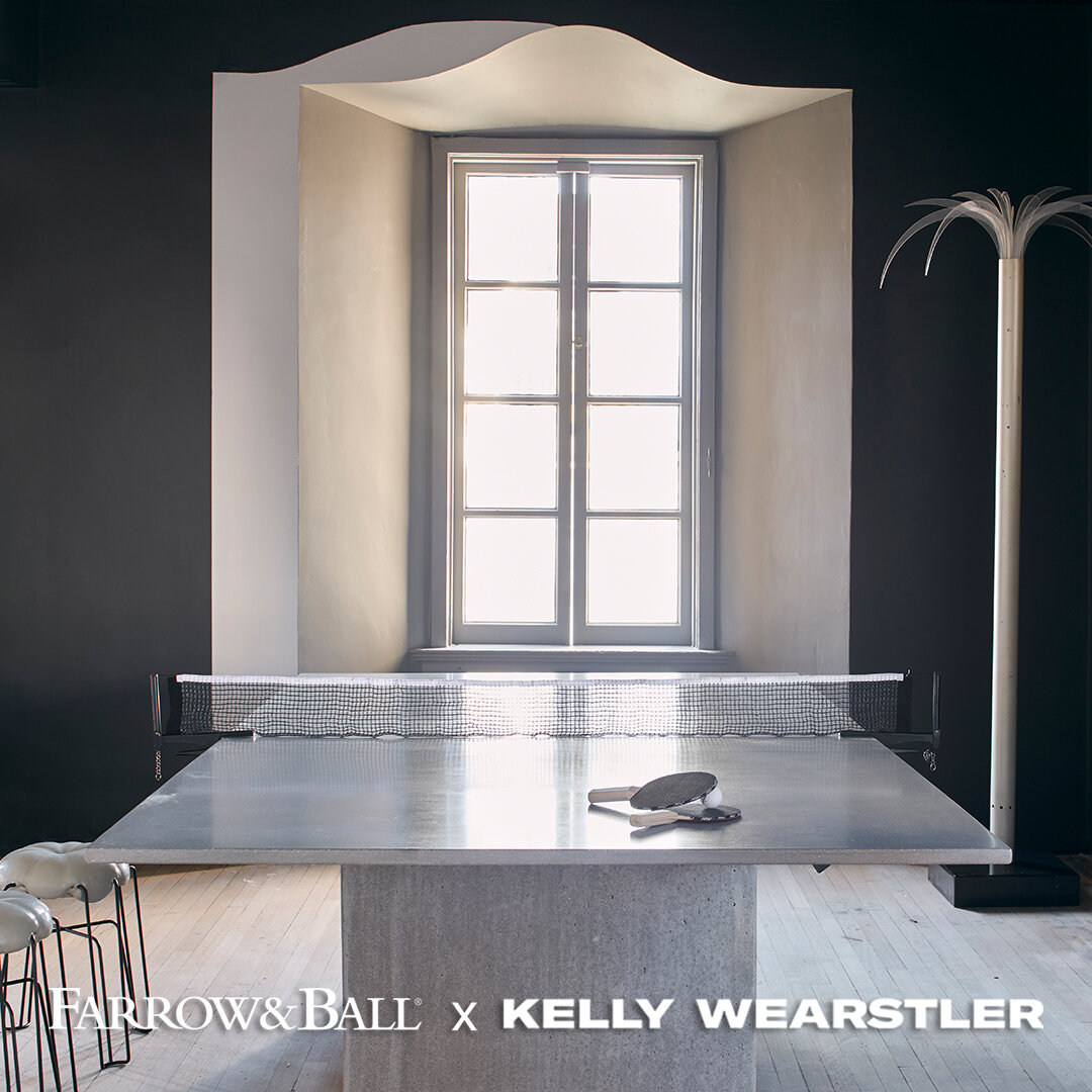
Visiting with 'The California Collection,' Farrow & Ball® x Kelly Wearstler
8 gorgeous colors introduced in 2021…

One of the bright spots of 2021 so far has been to introduction of Farrow & Ball x Kelly Wearstler ‘The California Collection’ into the offerings made possible by F&B paints. Maybe you’ve been following Kelly through the design world, or maybe she is a new name to you. Regardless, her collaboration with Farrow & Ball for this line has resulted in effortless yet sophisticated colors that not only work together as a ‘family’ but also fit in well with other colors in F&B’s current collection.
Let’s visit each of the 8 colors in the line:

Faded Terracotta- an apricot-toned earthy pink
Salt- a very clean and bright white that pairs well with cool colors
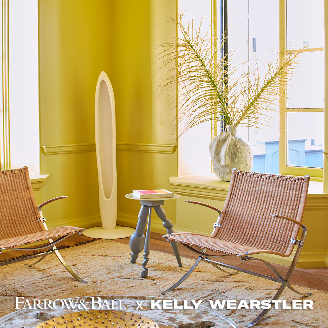
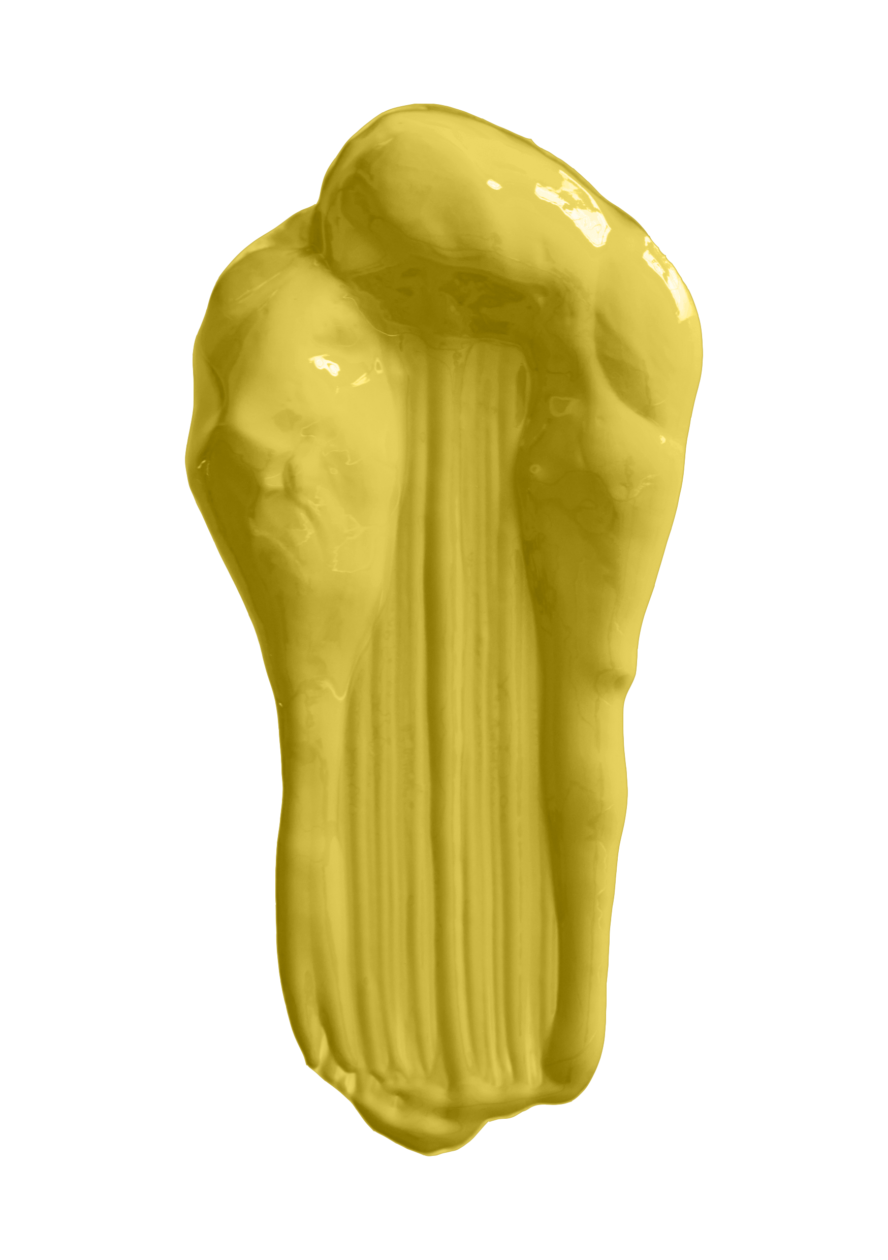
Citrona- a vivid ‘lemon’ color pop
Stoke- a warm brown-based grey, hence it pairs well with warmer colors

Palm- a bright ‘mint’ that can pair well with darker colors as well as bright, clean whites

Hazy- a cheery, clean pale blue
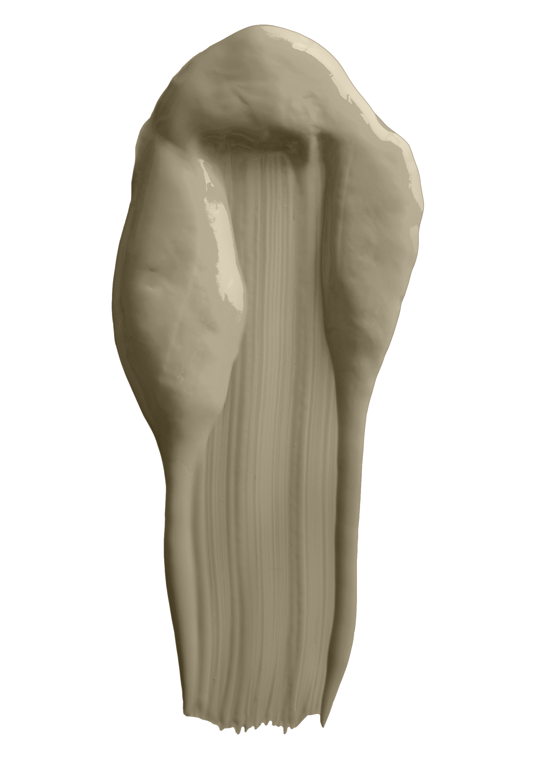
Sand- a stunning neutral that can pair well with both yellow or red-based colors
Tar- a very soft black that has some warm (almost brown) undertones
Each color has been carefully considered and can fit lovingly in homes across the globe, no matter one’s style. For sampling, F&B only makes samples of this collection as pre-painted sample cards at this time. This collection is available in the interior finished only (Estate Emulsion, Modern Emulsion, Estate Eggshell, and Modern Eggshell). Visit us to see colors in-person and to purchase sample cards!

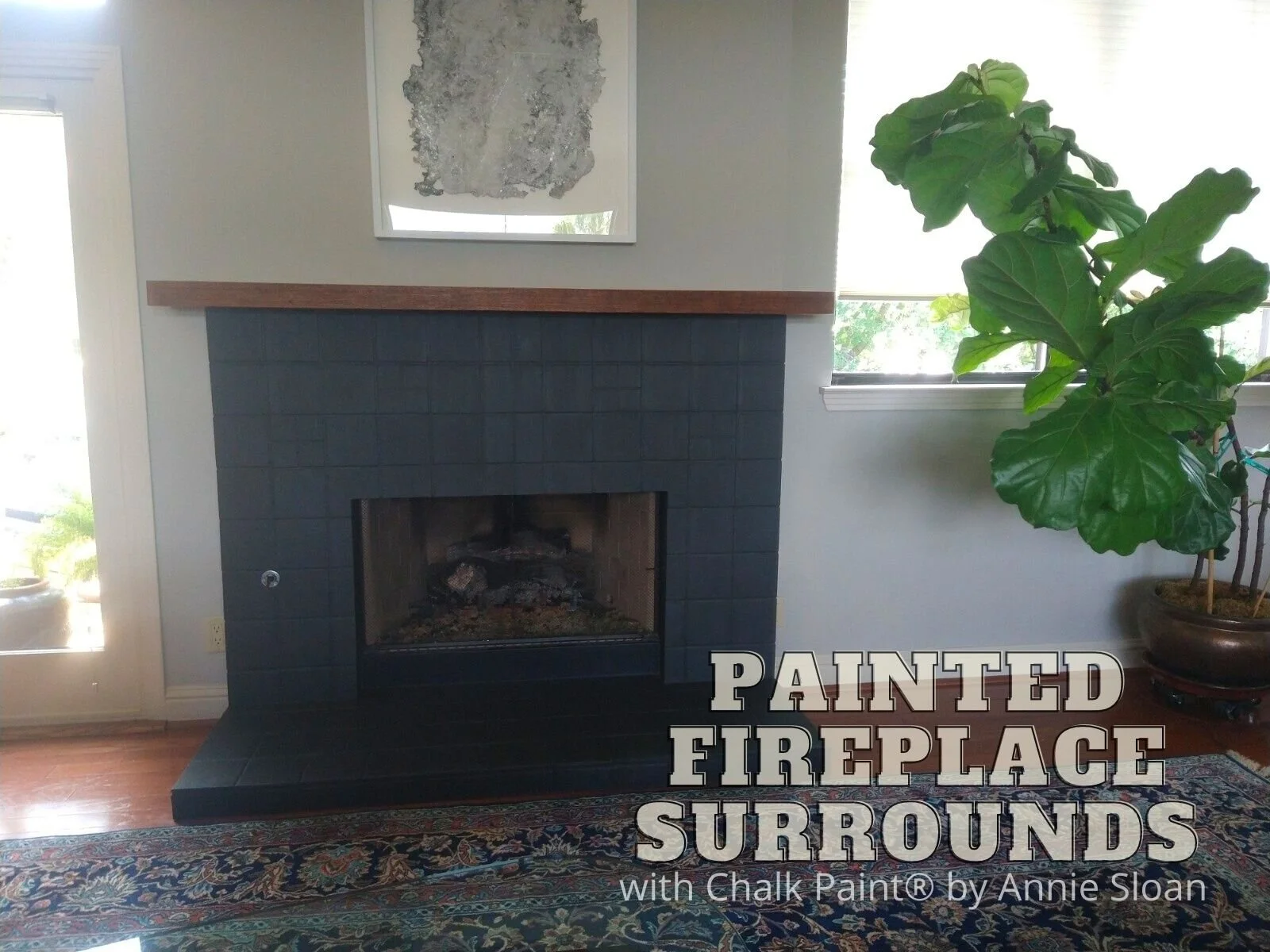
Home Improvement Project Idea: Painted Fireplace Surrounds with Chalk Paint® by Annie Sloan
Stuck at home like all of us? Painted fireplace surrounds can immensely change a room’s look and be knocked out in a weekend or less…
Hey there, 2020 sure has been a wild ride, and we’re here with our first blog post of the year. Good gosh. Like many of you, we have been spending increasing amounts of time at home and assessing every nook and cranny for ‘improvements’ to pass time and stay in our own space. Sometimes these improvements are purely based off changing style preferences, and sometimes are crucial to the overall state of certain rooms and structures.
One such project is changing up fireplace surrounds and mantles! Whether wood, tiled, or stone, they can be painted to varying degrees and styles. That’s great news because here in Texas, some of our stone fireplace surrounds are looking seriously dated. Instead of ripping out the old tile or stone, painting them up can be done in a weekend (or even shorter)! Here are two easy-to-knock-out painted fireplace surround ideas:
Complete Overpaint (Solid/Opaque Coverage, Over Tile and Possibly Even the Grout; Works Well on All Surfaces)- Chalk Paint® will cover both porous and slick-glazed tile, and certainly the grout as well (if it’s the wrong color, if it’s dirty, if you want complete-coverage and a knocked-back look). To paint, clean the tile first with a gentle eco-friendly degreaser (like Krud Kutter), nothing sudsy, rinse, and let dry; for porous tile, you may want to add 5-10% water to the paint to make it soak in very well, and for slick-glazed tile you may want to wait an extra long drying period between paint coats to prevent ‘double processing’ the paint (instead of a couple hours, wait several hours or even overnight between coats to allow an extra great bond to the tile). Apply as many paint coats as you’d like for desired coverage. You can certainly seal the paint, and Soft Wax often works best, just make sure that the surround doesn’t get too hot if a fire is lit!
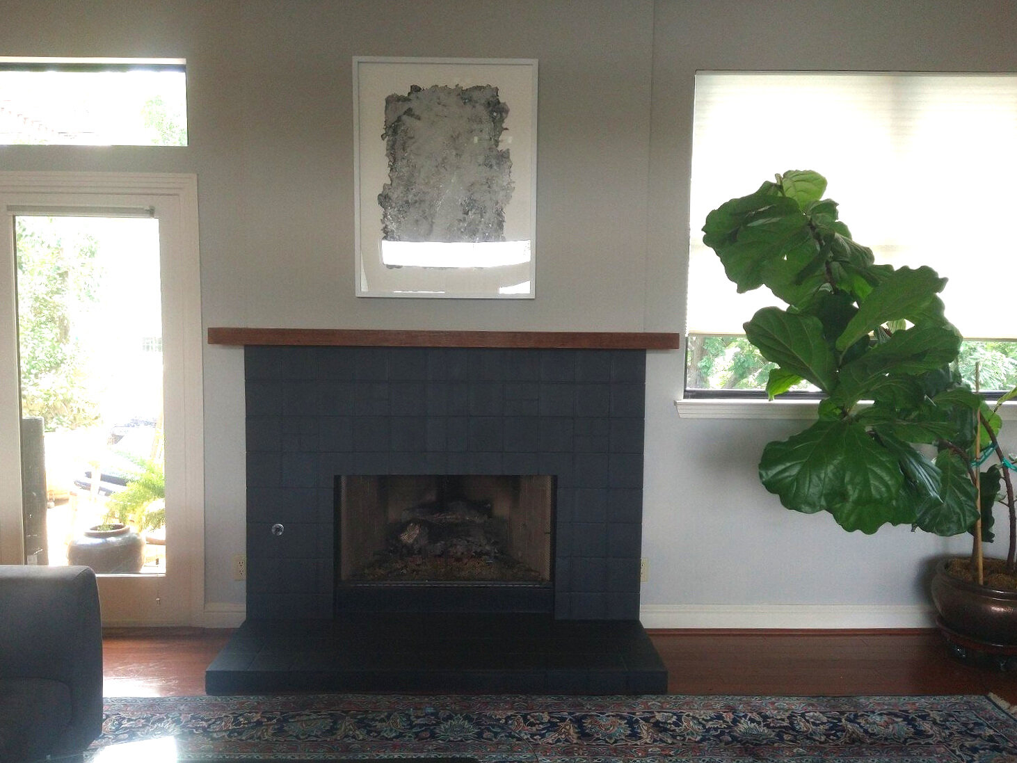
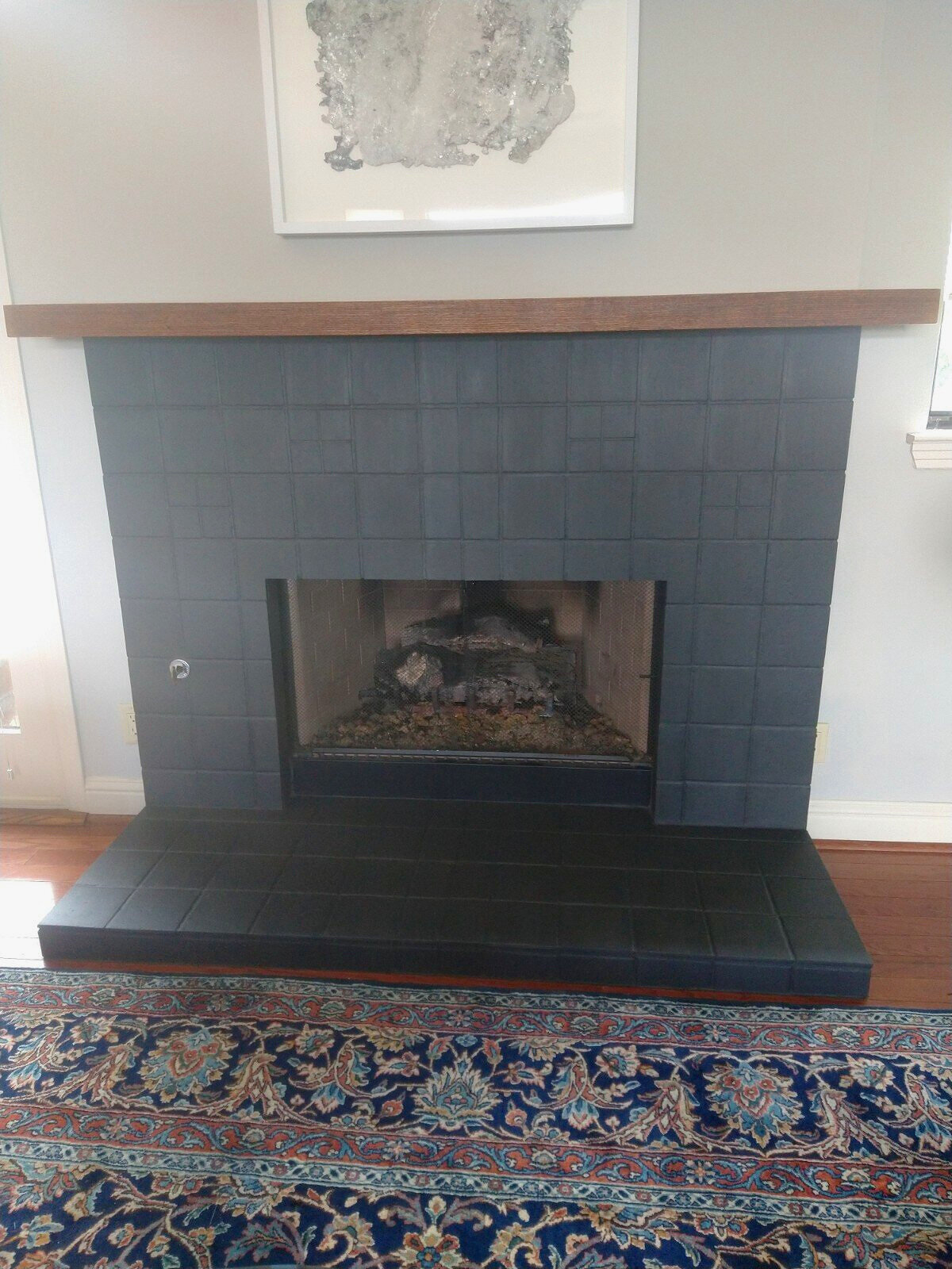
Project featured from a Silk and Sage custom-work client, done with Chalk Paint® in Graphite with solid coverage, followed by Clear Wax
Washed Effect (Transparent Paint Coverage/ Showing Some of the Base Material and Color Through the Paint; Works Best on Porous Materials Like Unsealed Tile and Stone, and Dry/Raw/Worn Woods)- To create this effect, choose your Chalk Paint® color (white and grey washes are extremely popular these days due to being so neutral BUT you can do color washes too!) and dilute the paint with water between 50%-80% water (depending on how transparent you want the paint layer to be), and mix paint and water up together very well. Make sure your surface is either degreased or at least make sure none of the stone or tile is crumbling or degrading, brushing off dust and soot. Apply your paint wash with a good natural brush, working in sections. If you want to remove some paint from certain areas and reveal some of the underlying texture and colors, wipe some paint wash away with a lint-free cloth. If wiping away, a great tip is to keep a spray water bottle handy nearby and spritz the washed areas before wiping them, especially if the wash is absorbing and drying into the surface quickly. Add more layers once dried if you like! And again, you may certainly seal the surface when done.

Project shared with Silk and Sage courtesy of customer, J.M., done with Chalk Paint® in French Linen as a more solid base coat followed by a wash with Old White
We love these looks and hope you do too! We are constantly asked about such projects year-round, and always receive lovely status updates on how everything has turned out and lasted over the years. Another way to incorporate this look into other spaces of your home would be on tiled or stone backsplashes too (not inside a shower or constant wet spaces however). If you try this type of project then drop us a line and let us know how it’s turned out! Continue to shop with us using our no to low-contact options to maintain our health during these times.
Happy painting, stay safe and well, xoxo